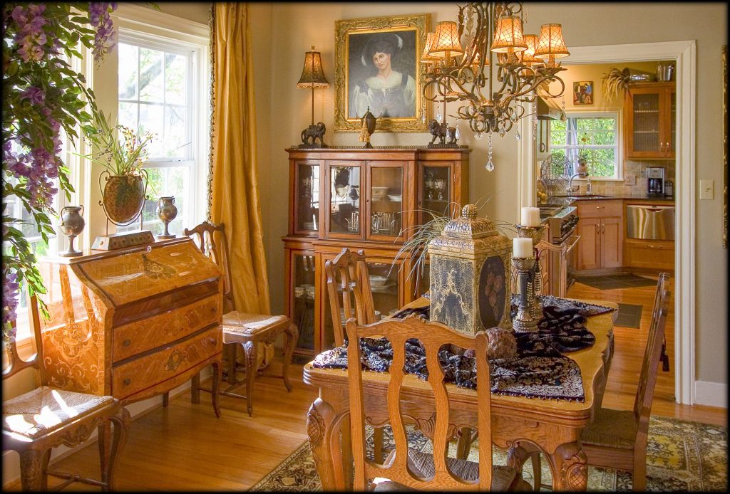
The five senses are an incredible thing. Smell and taste are two of the most powerful tools at evoking emotion. But sight must not be forgotten. After all, what you see can have an incredible impact on how you feel. Even more so, color can inevitably influence how you feel on an everyday basis without you ever really noticing. Which is exactly why incorporating the most appropriate hues into your own home can have a profound effect on how you feel (or would like to feel) while completing a specific task.
“Color can have a tremendously powerful influence on people’s lives,” explains Sally Augustin, PhD, an environmental/design psychologist and the principal at Design With Science. “I see a lot of people who are scared of it, who create one white space after another.” But, she says, you shouldn’t be afraid of the rainbow. In fact, you should embrace it. “Color is a fantastic tool to utilize in interior design. You can create a mood in a room instantly with the use of color, especially when utilizing it on your walls and in your accessories.” Here, Augustin details the best hues to add to the most common rooms in your home and the feelings they evoke.
KITCHEN
It’s no secret that certain colors influence you to eat a little more—and a little less. In fact, a 2012 study out of the Cornell Food and Brand Lab found study participants, who had a low contrast in color between their food and plates—for example, mashed potatoes on a white plate— served themselves 30 percent more food than those whose plates and food were high contrast in color. That same study found that the color of one’s placemat and tablecloth had the same effect. The same can be said for wall color, says Augustin. “Warm colors, generally, do seem to make us feel a little hungrier. They get our appetites flowing,” she says. “You can use this information in one of two ways: if you have children who never eat and weight isn’t an issue for you or your partner, you might want to make spaces like your kitchen or breakfast nook a warm color like an orange or brown. On the other hand, if someone tends to overeat, you would want to avoid those warm colors and opt for cooler hues such as blues and grays.”
BEDROOM
The bedroom is meant for sleep and relaxation and, as such, says Augustin, you want to avoid colors that will excite you such as a color in the red family. “Because of our cultural associations, we view blue as a calming and relaxing color,” she says; however, if a pale blue is not what you’re looking for, Augustin recommends a “color that’s not very saturated but relatively bright. A sage green with lots of white or a dusty blue with lots of white mixed into it are perfect for the bedroom.”
color wheel
Pantone is the authority on color. In fact, the color-system company’s forecasted color of the year is so closely watched that industries beyond interior design—think fashion—look to it as one of the biggest trend-setting announcements of the year. Here’s a look at the last five years of colors that Pantone has deemed the “it” hue of the year.
2017: Greenery
Get ready to see plenty of this fern-colored hue as the current color of the year dominates trends.
2016: Rose Quartz and Serenity
Pantone says they chose this pink-and-blue duo to evoke feelings of warmth and tranquility.
2015: Marsala
The company notes that this warm wine color is ideal in a kitchen or dining room.
2014: Radiant Orchid
This shade of purple has fuchsia and pink undertones. The company suggests pairing it with deeper hunter greens, turquoise, teal, or even light yellows.
2013: Emerald
This jewel-tone green hue is ideal in accessories such as dinnerware, or in an entryway or foyer, dining room, home office or library, or a powder room.
HOME OFFICE
If you have a home office, you know that it’s oftentimes a place to brainstorm ideas. Research shows that green can actually get your creative juices flowing. Like the bedroom, Augustin recommends “a sage green that isn’t very saturated in color to achieve that ideal balance that enhances creativity without over-stimulating you.”
EXERCISE ROOM
Need a burst of energy to crank out that workout? Go red! “Seeing the color red gives you a burst of strength,” explains Augustin. “If you have a place in your home where you work out, paint the wall you’re looking at red to have that burst of strength while you exercise.”


